DESCRIPTION
Take home technical alignment test
My ROLE
UX Designer, UI Designer
About Getsmarter
GetSmarter is an online learning platform that provides professionals with a
betterlearning experience and equips them to thrive in the future of work. GetSmarter offersonline short courses from leading universities across the globe.
The Assignment
I was tasked to conceptualise a version of their online campus dashboard. This is a learningportal their students use to access and engage with their course material. The task needs to focus on a design for the general dashboard.
The Problem
Getsmarter's online campus learning portal is inaccessible and doesn't serve as much motivation for its students to take their courses with ease. They are looking to
re-design it keeping in mind that they would like there to be an activity feed as well
as social forums for students to interact on.
The Process

To start off with I had to cultivate empathy and a sense of who I am designing for. In order to do this I extracted and developed a protopersona based on the information provided to me. Thereafter I drew up the user flow that the student follows when interacting with the existing website of Getsmarter. These steps lead me to extract specific goals that I can aim for that is unique to the target audience that will enhance their experience with the online campus dashboard.
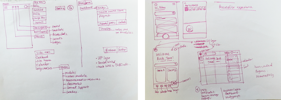
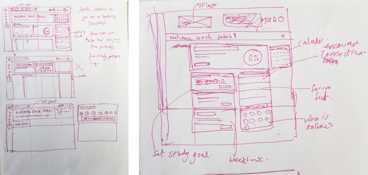
After establishing goals I started drawing up low fidelity wireframes. When I have decided on a direction for the layout and flow I start designing a higher fedility wireframe. At this stage I will make changes as and iterate where I see room for improvement. The final step is the prototype and final UI designs.
Emphathise
Proto Persona
Getsmarter has provided me with the following information about their target audience:
Our audience is working professionals looking to make strategic career advancements.They are interested in our courses that would help them get a step up in their currentrole and are interested in the quality and flexibility GetSmarter has to offer.
I decided to create a proto persona based on the above description that Getsmarter has provided me with in their brief. I have added more detail in order to be able to define a goal as much as possible. I believe this is important if I am going to place myself in their shoes in order to guage what sort of unique needs the dashboard would need to meet.
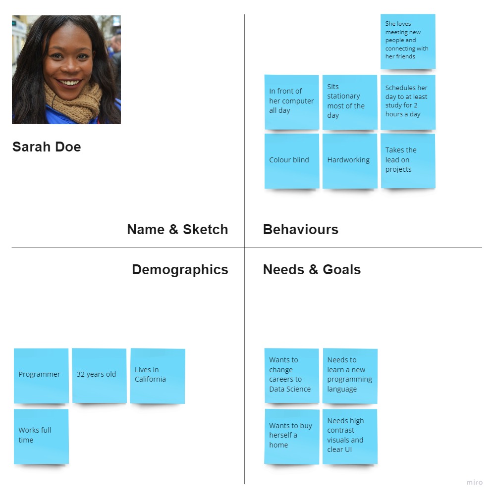
Key Insights:
- She is Goal-oriented
- She is a hard worker and likes to keep track of her progress
- She loves socialising and meeting new people
Some pain points that she might experience:
- She is visually impaired and needs things to have clear contrast
- After a long day at work she needs to muster up energy to study
- She is socially deprived beause of sitting in front of a computer all day
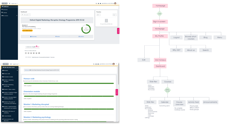
Analysing the existing product
I decided to analyse the existing dashboard in order to envision what sort of painpoints the user might be facing and what elements might already be working in the design. I also drew out the existing userflow of the site to see where the main points are and how the information is structured. This will inform my user story on the next step.
Key Insights:
- She is Goal-oriented
- She is a hard worker and likes to keep track of her progress
- She loves socialising and meeting new people
Some pain points that she might experience:
- She is visually impaired and needs things to have clear contrast
- After a long day at work she needs to muster up energy to study
- She is socially deprived beause of sitting in front of a computer all day
Understanding the user
After analysing the website and envisioning what the user might be experiencing and bsed on the proto persona I created I wrote up a few priorities and pain points.
Sarah’s priorities are:
- Learning a new skill
- Dedicate at least 2 hours a day to studying
- Access the Getsmarter online campus efficiently
Sarah’s pain points:
- Not being able to see her progress or create goals
- Not being able to visualise a complete overview of her course and dates
- No visible activity from other students
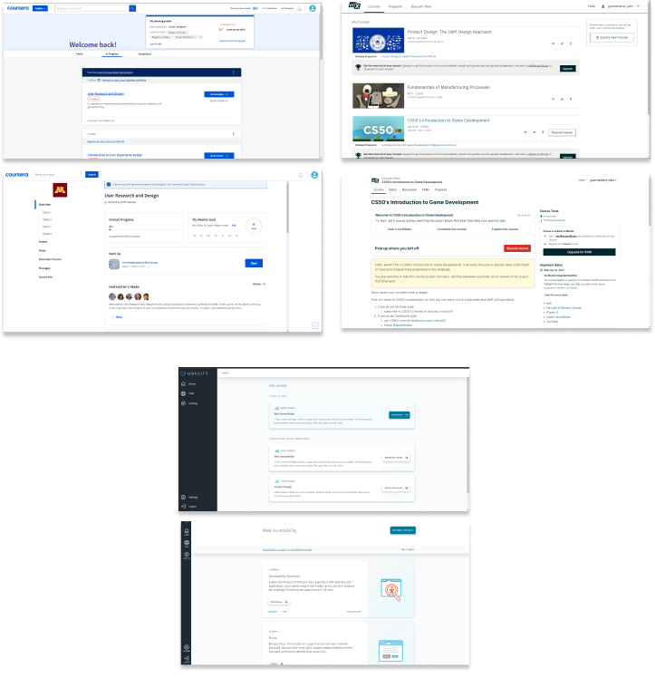
Market Research
I decided to first look at existing online campus that are readily available online, such as EdX, Coursera, Futurel earn and Udacity. It’s not neccessary to reinvent the wheel if someone else already designed something that works. With this in mind I analysed these dashboards and took note of what I thought worked well on them and what I can redesign to work on Getsmarter’s dashboard.
Some insights I have extracted from these:
Coursera has a section that allows the user to customise their learning profile
They display progress and weekly goals that are customisable. EdX's section for important dates could be a hellpful element that brings attention to students for when they need to hand in assignments. Udacity has a simple and minimalistic layout that makes information digestible and not overwhelming to the student. All of them has a ‘resume where you left off' section. This is handy as maybe the student logged on knowing they just want to continue the course. This could be a primary CTA.
DEFINE
Design Goals
Based on the assumptions, information provided to me and limited insights, I was able to define a few specific design goals I would like to focus on for this use case.
- Design an element that lets user set learning goals
- Include activity feed and a means to prompt students to connect
- Include a more complete overview of course and progress
- Ensure accessibility requirements are met according to WCAG
prototype
The Final UI

Going Forward...
This was an interesting case study and I learned a lot in terms of empathizing with my user and how to design a dashboard for user.
- I need to add a support button in the nav bar.. This is a more tricky thing as on the original site it is on a tab in a n awkward position. It is also important that this function be accessible.
- It would be important to do user testing. It’s the only sure way to know if this design will be effective.
- I would like to still add more screens with the different tabs open. This would also give a more holistic view of how the navigation is. An interactive prototype will also help for this
- I would love to have the opportunity to do user testing on more disabled people as that would help so much for making the final product accessible.
Overall this was a fun and insightful excercise for me and I have learned a lot, especially when it comes empathising with my user.